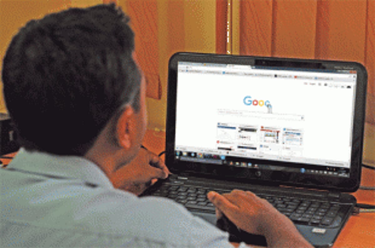
On September 2, 2015, Google
users at home and office-goers
who succeeded in getting to their
workplace despite the nationwide
bandh were in for a surprise as they
watched their good old Google logo
literally get wiped off their screens,
only to be replaced by a solid, sedate,
sans serif version of the previous one.
This new logo will soon be seen across
all its products.
While Google’s doodles usually
create quite a buzz, the change usually
lasts for just a day. This permanent
“new look” has evoked an even louder
reaction. Shradha Naik, a writer from
Panjim, says, “I was surprised to see
the change in the Google logo on my
computer screen as I switched on my
PC. I always enjoy playing the different
Google Doodles that the website
comes out with; this was no different.
This Google logo was also interesting
as it came with an ‘E’ alphabet tilted.”
According to the link the new
logo led users to, this redesign is one
of the biggest since 1999. For those
interested, the website goes on to give
a detailed description about the logo
over the years, including its change
in colour, effect and the picking up
and dropping of the exclamation
mark. The redesigning of the logo was
apparently done with an intention to
understand the way people react with
Google products across different apps
and devices.
“Due to my line of work, I am
a frequent user of the internet and
always take note of the various
changes and upgrades that take place.
But, the said logo change does not
make any difference to me, as long as
Google operates in the same manner
and my work gets done,” says Varad, a
computer teacher.
It has been learnt that the move
came about after a major restructuring
of the company was unveiled. Google
is now owned by Alphabet, a holding
company created by founders Sergey
Brin and Larry Page to separate
their money-making search engine
company from its other, lesssuccessful
products.